You should spend about 20 minutes on this task.
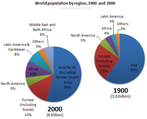
The pie charts below give information about world population in 1900 and 2000. Summarise the information by selecting and reporting the main features, and make comparisons where relevant.
Write at least 150 words.

Sample answer
The pie charts illustrate changes in the population of different areas of the world between 1900 and 2000. The major regions are represented as percentages of the total world population.
From 1900 to 2000, the percentage of people living in Africa more than doubled from 4.5% to 10%, while Latin America’s proportion almost tripled in the same period. On the other hand, the percentage of population in Europe and Asia decreased over the last century. Europe’s percentage dropped from 25% to 14%, while Asia declined from 60% to 54%. North America’s percentage however, remained constant at 5% in 1900 and 2000. The Middle East and North Africa, a new category in 2000, represented 6% of world population.
Overall, this represents a huge increase in the number of humans on the planet, from 1.6 billion to 6 billion in just one century. Most of this population growth has occurred in developing countries.
(151 words)
