You should spend about 20 minutes on this task.
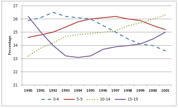
The graph shows children by age group as a percentage of the young population in the United Kingdom between 1990 and 2001. Summarise the information by selecting and reporting the main features, and make comparisons where relevant.
You should write at least 150 words.

Sample Answer
The line graph gives data on the proportion of children with respects to the total young population in the UK between 1990 and 2001. The proportion of children are categories in four age groups. Overall, the ratio of infants, between 0 to 4 years old, declined over the period while 10 to 14 years youngsters’ percentage increased in the UK.
As can be seen in the diagram, just over a quarter of the UK children was 15 to 19 years old in 1990 while a similar proportion was 0 to 4 years old at that time. Just over 24% of young British were between 5 to 9 years old while 23% of them were 10 to 14 years old. With an increase from 1990 to 1992, the proportion of infants kept on decreasing and in 2001 accounted for over 23% of total youth. With a steady slump till 1996, 15-19 years old constituted a quarter of young British in 2001.
Moving further, 10-14 years British dominated the young generation in the UK with a steady increase in their percentage in later years despite their least proportion in early years. Finally, 5-9 years British children were over 26% during 1995-1997 but their ratio declined and finally stood at just over 25% in 2001.
