You should spend about 20 minutes on this task.
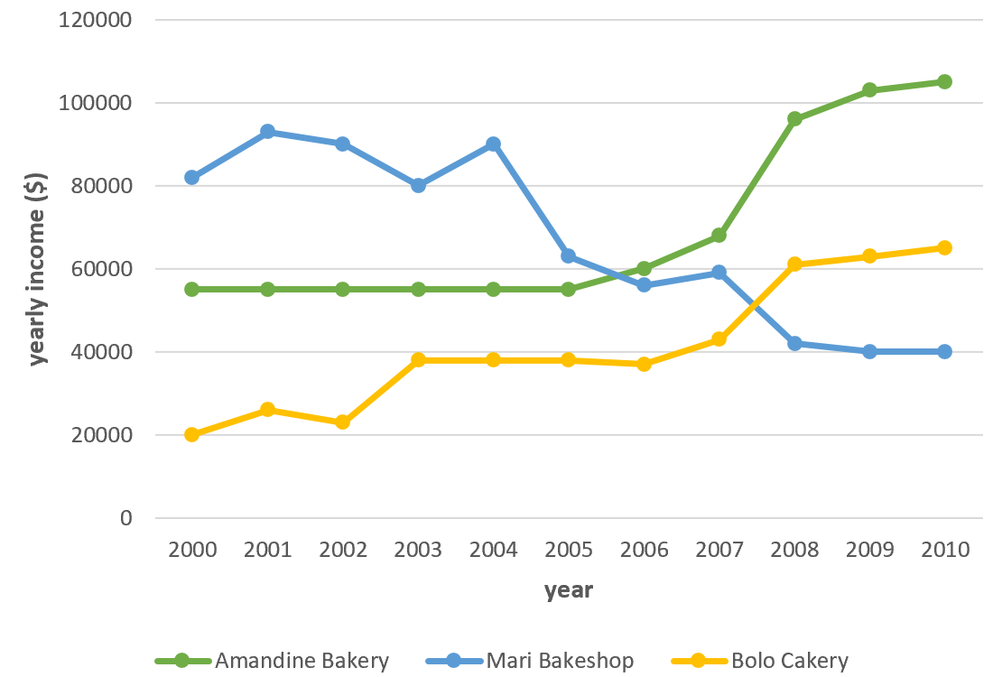
The graph shows data about the annual earnings of three bakeries in Calgary, 2000-2010. Summarise the information by selecting and reporting the main features, and make comparisons where relevant.
Write at least 150 words.

Sample Answer
The graph shows information about the amount of money which was earned by three bakeries in Calgary, over a ten-year period between 2000 and 2010.
Overall, what stands out from the graph is that there were considerable upward trends in the income of both Bolo Cakery and Amandine Bakery, while the earnings of Mari Bakeshop saw a considerable fall over the period in question. Another interesting point is that Mari Bakeshop was the most popular bakery in 2000, but in 2010, Amandine Bakery earned more money than the others.
Looking at the details, as regards Bolo Cakery, income started at $20,000 in 2000, then there was a fluctuation over the next three years, at which point it levelled off at just under $40,000 until 2006. Then the figure went up significantly, finishing at around $65,000 in 2010. If we look at Amandine Bakery, the trend was similar. Having remained stable at approximately $55,000 in the first half of the decade, income then rose sharply, reaching nearly $100,000 in 2008. There was then a gradual rise to around $105,000 in 2010.
By contrast, the income of Mari Bakeshop went in the opposite direction. Takings fluctuated around $90,000 until 2004. After That despite falling sharply to just over $40,000 in 2008, the figure then levelled off in the last two years.
(219 words)
