You should spend about 20 minutes on this task.
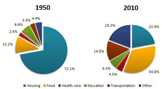
The pie charts below show the average household expenditures in a country in 1950 and 2010. Summarise the information by selecting and reporting the main features, and make comparisons where relevant.
Write at least 150 words.
Sample Answer 1
The two pie charts compare the average nationwide expenses on several household categories, including housing, food, healthcare, education, and transportation, in 1950 and 2010. The expenditure ratio for food soared in 6 decades, while an overwhelming portion went on to housing in 1950.
Now turning to the details, the bulk of the expenses in 1950 were made for housing and food, accounting for 72.1% and 11.2% of the total expenditures. On the opposite, it can be observed that people prioritized buying food (34%) more than housing (22%) six decades later. Health care had the lowest amount of money spent in both of the years. In addition, transportation expenses had remarkably increased roughly three times from only 3.3% in 1950 to 14% in 2010. Aside from that, spending on other items rose to 19.3% from 4.4% in 1950. The education expense ratio, however, had slightly decreased, where people insignificantly spent 0.3% more in 1960 than in 2010.
To summarise, basic necessities such as food and housing are the two main categories people spent the most percentages of money on; however, the health care aspect was the least prioritized.
Sample Answer 2
The pie charts show the expenses in a country’s housing, food, healthcare, education, transportation, and other items in 1950 and 2010. As is observed from the pie charts, in 1950, almost two-thirds of expenditure was on housing, whereas this average expenditure increased for food, transportation, etc. in 2010.
According to the given data, more than 70% of the people in this country went to housing in 1950. The second most expenditure in this country was on food. All other spendings, including healthcare, education, transportation, etc., were less than 20% in total. After 60 years, the trends of expenditure in this country significantly changed. People’s spending on housing decreased to only 22% while the expenditure on food increased to just over one-third of the total. Interestingly, the spending on education decreased over time while the expenses for transportation increased to 14%. All other expenditure in 1950 was only 4.4% which increased to roughly 20% in 2010, which indicates the new addition in the category where people started expensing more than they did in 1950.
In summary, the expenditure nature of people had changed significantly in 2010 than in 1950, and it is evident that expenses on food upsurged.
Sample Answer 3
The two pie charts compare the household outlay in a country by major categories in 1950 and 2010. Overall, in both years, significant expenditure went for accommodation and food, covering most of the expenditure. However, in 2010, the spending ratio escalated for food while decreasing for housing.
In 1950, nearly two-thirds of the expenditure of people went to accommodation and more than 11% on food. The expenditure on housing plummeted in 2010, from 72.1% to 22.0%, while it almost trebled in the case of food. The Healthcare expenditure ratio, on the contrary, was the lowest, only 2.4%, and it increased by nearly 2% in 2010. Similarly, the outlay on transportation was elevated in 2010 by nearly 10%. The cost ratio for education was 6.6% in 1950, slightly decreasing after six decades. Other categories attributed to only around 4% expenditure and roughly quintuple during the period.
In summary, housing drained the highest percentages of money for the people in this country in 1950, and after 60 years, it reduced while the ratio of expenditure on food increased remarkably.
Sample Answer 4
The two pie charts give information about what households spent their money on / household expenditure on goods and services in 1950 and 2010. It is immediately obvious that there are some quite significant differences / some things are significantly different between the two charts.
In 2010 the largest proportion of expenditure was / most money was spent on food whereas in 1950 it was on housing, with food for just 11.2%. There is a great difference in terms of the amount of money people’s spent on housing / housing expenditure between the two years. In 1950 72.1% of the total household budget / the total of what households spent went towards housing, compared to only 22% in 2010.
There has been a notable increase in / People have notably increased the amount of money spent on transportation between the two dates. In addition, the charts show a significant rise in the proportion of money spent on health care / that people spent more on health care in 2010 compared to 1950.
There are some similarities, however. For example, in both 1950 and 2010 people spent a similar proportion on education. / the proportion of education expenditure was roughly the same.