You should spend about 20 minutes on this task.
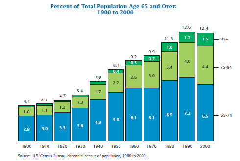
The chart below shows the percentage of total US population aged 65 and over between 1900 and 2000. Summarise the information by selecting and reporting the main features, and make comparisons where relevant.
Write at least 150 words.

Sample Answer
The bar chart shows the percentage of the total population aged 65 and over in the U.S. between 1900 and 2000. In the year 1900, just over 4% of the population was aged over 65. However, by 1960 this figure had doubled.
The number of people aged between 75 and 84 remained relatively steady between 1900 and 1930, making up only 1-1.3% of the population. The figure began to rise more significantly in 1940, and by 1970 it had tripled to 3% of the population.
Although there was no change in the number of people aged 65 -74 between 1960 and 1970, the number of people aged 75 and over increased during this time. By 2000, 12.4% of the US population had reached the age of 65 or more, although this was slightly lower than in 1990 when it peaked at 12.6%.
The chart shows that today people in the U.S. can expect to live longer than in 1900. By 2000, more than 12% of the population had lived to the age of 65 and over, compared to only 4.1% in 1900.
(187 words)
