You should spend about 20 minutes on this task.
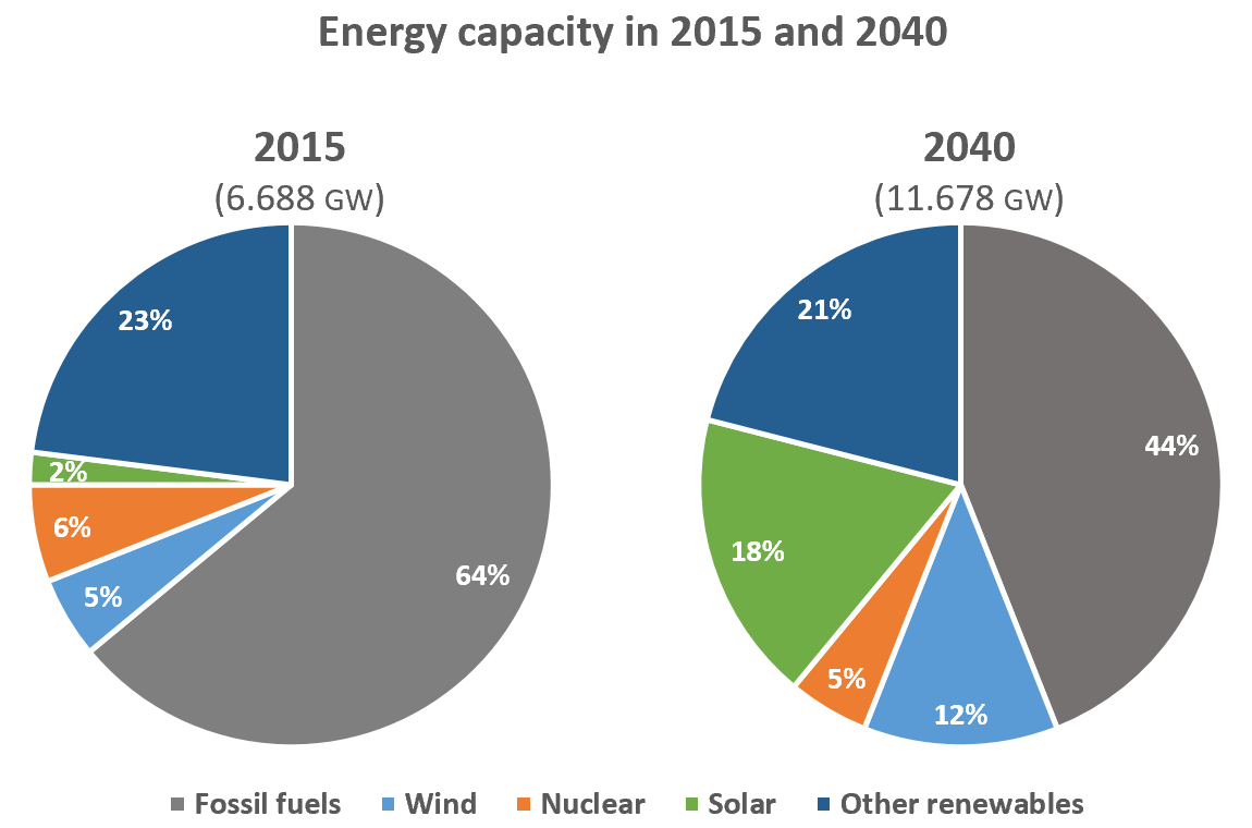
The pie charts below compare the proportion of energy capacity in gigawatts (GW) in 2015 with the predictions for 2040. Summarise the information by selecting and reporting the main features, and make comparisons where relevant.
Write at least 150 words.

Sample Answer
The charts show the expected changes in energy capacity in 2040 compared to 2015.
The most noticeable feature is the drop in the proportion of the annual gross capacity of fossil fuels, with the projected capacity almost doubling from 6.688 to 11.678 gigawatts. It is expected to experience a significant decline, falling from 64% in 2015 to 44% in 2040. By contrast, it is predicted that there will be a dramatic rise in the proportion of energy capacity from solar energy with a jump from 2% to 18% in 2040. While the proportion of the capacity for wind is anticipated to increase more than twofold from 5% in 2015 to 12% in 2040, it is estimated that other renewables will account for a smaller proportion with a decrease from 23% to 21%. The projected proportion for nuclear energy will be 5% in 2040, a slight decline from 6%.
It is clear that despite the decline in the proportion of energy capacity from fossil fuels and the rise in solar and wind sources, the former will remain a major energy source in 2040.
(182 words)
