You should spend about 20 minutes on this task.
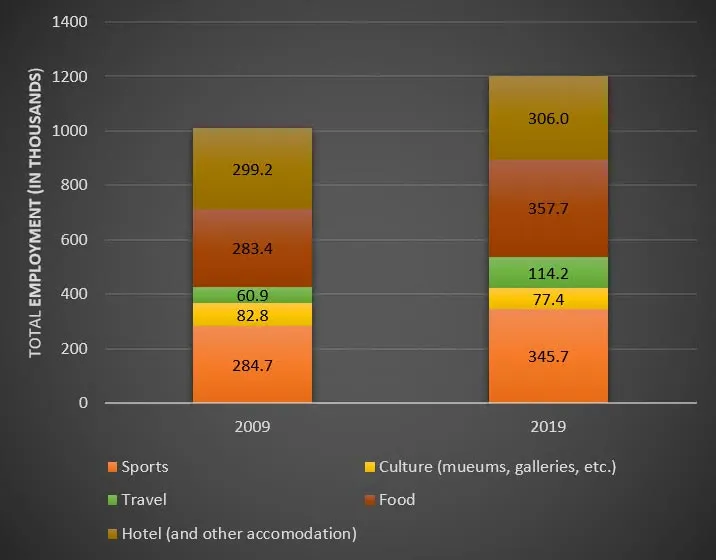
The bar chart below shows employment figures in different tourism-related industries between 2009 and 2019. Summarise the information by selecting and reporting the main features, and make comparisons where relevant.
Write at least 150 words.

Sample Answer
The chart provides a breakdown of employment in a number of tourism-related industries over a ten-year period. Overall, we can see that the total level of employment increased by about twenty per cent during the period. However, there was some variation in the figures for the individual sectors. For example, while the travel industry increased its workforce substantially over the decade, there was relatively little growth in that associated with hotels and other tourist accommodation.
Travel represented the biggest area of expansion, having almost doubled its number of employees by 2019. The food industry also saw a significant increase, from 283,000 employees in 2009 to 357,000 in 2019, while the sports industry enjoyed an almost equal level of growth. The least successful sector was culture, including museums and art galleries, where the figures actually fell slightly over the period.
The data suggests that, despite minor fluctuations in the various sectors, employment in the tourism industry as a whole will continue to grow.
(162 words)
