You should spend about 20 minutes on this task.
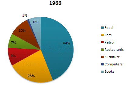
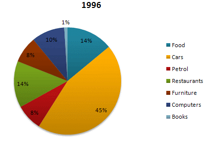
The given pie charts compare the expenses in 7 different categories in 1966 and 1996 by American citizens.
Write a report for a university lecturer describing the information below.
Write at least 150 words.


Sample Answer 1
The pie charts compare how Americans spent on different commodities in 1996 with that of 1966. The expenses are given as percentages and it is obvious that cars consumed the highest percentages of American citizens’ expenditure in 1996 while it was food that required the highest ratio of money in 1966.
According to the illustration, four-tenths of Americans’ expenses went on food in 1966 and they spend almost one-fourth on cars. The lowest spending Americans made was for computers which was merely 1%. Expenses by them in 1966 on furniture and petrol was roughly one-tenth each and their budget for books and restaurant meals were 6 and 7 percentages respectively.
After three decades, the expenditure pattern by Americans on those goods changed noticeably. They spent 45% on cars, which constituted their highest ratio of spending on a consumer product and spending on food preparation dropped by 30%. It is interesting to note that the spending on books reduced to barely 1% while this figure went up to 10% for computers. They spend exactly double for outside meals than they did in 1966 and their cost for petrol dropped by 1% despite a hike in spending on automobiles. Finally, Americans share of spending for purchasing furniture reduced by 2% in 1996 than that of 1966.
Sample Answer 2
The pie charts compare the expenditure of US residents in two different years in seven categories namely food, cars, petrol, restaurants, furniture, computers and books.
It is clear that the largest proportion of American citizens’ spending went on foods and cars. On the other hand, computers and books have the lowest percentage in the chart in 1966 and 1996 respectively. In 1966, 23% of American citizens’ expenditure went on cars. The percentage rose to nearly double at 45% in 1996.The proportion of spending on food fell from 44% in 1966 to only 14% in 1996.
Expenditure on computers stood at only 1% in 1966 but reached 10% in 1996. The percentage of American citizens spending on restaurants had doubled from 7% in 1966 to 14% in 1996. Spending on books was highest in 1966, at 6%. By contrast, there was no significant change in the proportions of petrol and furniture over a period as a whole.
Sample Answer 3
The pie charts compare Americans’ expenditure in 7 different categories namely food, cars, petrol, restaurants, furniture, computers and books in 1966 with that of 1996. Overall, the least significant percentage of spending by Americans went on computers in 1966 while the food cost them the highest percentage. After three decades, cars became the largest segment of expenses by American residents and the smallest segment was spent on books, percentage-wise.
Cars accounted for 23 percent of expenses by Americans in 1966 and after thirty years, this ratio remarkably increased to 45%. The expense of dining out in 1966 was 7 percent and it had doubled in 1996 (14%). Only 1 percent of the American population’s money went on purchasing computers but this figure rose to 10 percent in 1996. Food comprised 44 percent of all the expenses made by Americans in 1966, and it fell to 14 percent in 1996. In 1966, petrol and furniture outlay was at 9 percent and 10 percent respectively and remained relatively unchanged over a 30-year period. Lastly, expenditure on books had plunged from 6 percent to 1 percent at the end of the period.
Sample Answer 4
The pie charts show changes in American spending patterns between 1966 and 1996. Generally speaking, Americans spent the highest proportion of their money on food and car in 1996 and after three decades, cars comprised their highest costs.
Food and cars made up the two biggest items of expenditure in both years. Together they comprised over half of household spending. Food accounted for 44% of spending in 1966, but this dropped by two-thirds to 14% in 1996. However, the outlay on cars doubled, rising from 23% in 1966 to 45% in 1996. Other areas changed significantly. Spending on eating out doubled, climbing from 7% to 14%. The proportion of salary spent on computers increased dramatically, up from 1% in 1996 to 10% in 1996. However, as computer expenditure rose, the percentage of outlay on books plunged from 6% to 1%. Some areas remained relatively unchanged. Americans spent approximately the same amount of salary on petrol and furniture in both years.
In conclusion, increased amounts spent on cars, computers, and eating out were made up for by drops in expenditure on food and books.
Sample Answer 5
The two provided pie charts compare the expenditure of Americans in 7 different categories namely food, cars, petrol, restaurants, furniture, computers, and book between 1966 and 1996.
It is evident from the information provided that foods and cars made up the biggest proportions of spending among Americans in both years. Specifically, in 1966, the highest proportion of expenses went to food with 44% of the total expense, followed by cars with 23%. After 30 years, this figure observed a reversal when the spending for cars accounted for a massive 45% while that for food dropped to just 14%.
Turning to the other expenses, petrol and furniture stood for roughly equal proportions of money spent with 9% and 10% respectively in 1966 and both 8% in 1996. The expenditure for restaurant experienced an increase of 7% in 1966 and a double to 14% after 30 years. It is also interesting to note that the spending on books and computers changed conversely. Over the 30-year period, the figure for books declined from 6% to a negligible 1%, in contrast, money spent on computers underwent a remarkable growth from 1% to 10%.
In short, Americans spent most of their money on food and cars in both 1966 and 1996, and the spending for computers increased considerably after 30 years.
