You should spend about 20 minutes on this task.
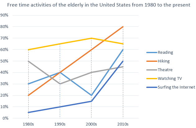
The graph below shows how elderly people in the United States spent their free time between 1980 and 2010. Summarise the information by selecting and reporting the main features, and make comparisons where relevant.
Write at least 150 words.

Sample Answer
This graph shows the kinds of activities done by old people in their spare time, covering a period from the 1980s to now in the United States. We can see that generally the activities listed have been increasing in popularity amongst the elderly, with hiking increasing steadily throughout the years, and watching TV being the most popular overall.
In the 1980s, nearly all activities were growing in popularity. The only activity which was becoming less popular over these years was going to the theatre. Going to the theatre declined steeply from 50% to 30%.
This changed in the 1990s, and going to the theatre became more popular, whereas reading saw a dramatic drop in popularity. The number of people doing all other activities increased.
This century, hiking, reading, going to the theatre and surfing the Internet have all been increasing in popularity. However, watching TV has been decreasing in popularity. Despite this, watching TV is still the second most popular activity nowadays amongst this group. Most elderly people are hiking nowadays in their spare time.
(174 words)
