You should spend about 20 minutes on this task.
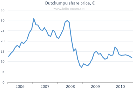
The line graph below shows the changes in the share price of Outokumpu companies in euros between January 2006 and December 2010. Summarise the information by selecting and reporting the main features, and make comparisons where relevant.
Write at least 150 words.

Sample Answer
The graph shows the changes and a decline overall in the share price of Outokumpu in a five-year period from January 2006 through December 2010.
At the beginning of this period the share price was at EUR 13 per share. There were several fluctuations until late 2006 when there was a sudden increase from EUR 21 to EUR 31. This higher price did not last long, however, and it fell before rising strongly again in 2008. From mid-2008 there was a sharp downward trend through the end of the year when it fell to the lowest point in this period at just over EUR 7 per share. After that the share price recovered and, despite some fluctuations, continued to rise until it reached a peak of EUR 17 in early 2010. Until late 2010 the trend was downward again, ending the year at just over EUR 12.
Outokumpu made significant gains and losses during this period but overall lost around EUR 1 per share.
(164 words)
