You should spend about 20 minutes on this task.
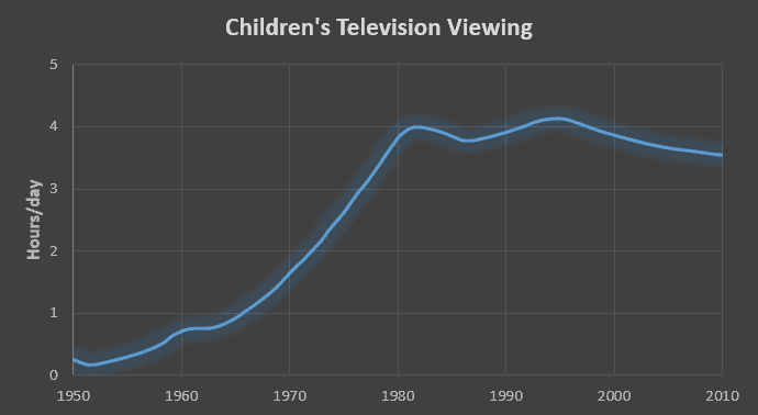
The graph below shows the number of hours per day on average that children spent watching television between 1950 and 2010. Summarise the information by selecting and reporting the main features, and make comparisons where relevant.
Write at least 150 words.

Sample Answer
The graph shows the number of hours per day on average that children spent watching television. The graph covers the period between 1950 and 2010.
From 1950 to 1960, there was a modest rise in the average number of hours children spent in front of the television set. This was followed by a marked increase from approximately one hour to four hours of viewing per day among children between 1965 and 1982. Over the next five years, there was a decrease. However this trend proved negligible as the viewing figure then rose again marginally, and it reached a peak of over four hours in 1995.
Between 1995 and 2010, there was another modest decline in the hours children spent watching television.
Overall, it can be concluded that there has been a significant rise in television viewing over the sixty-year period, though there is some indication that this trend may be changing.
(151 words)
