You should spend about 20 minutes on this task.
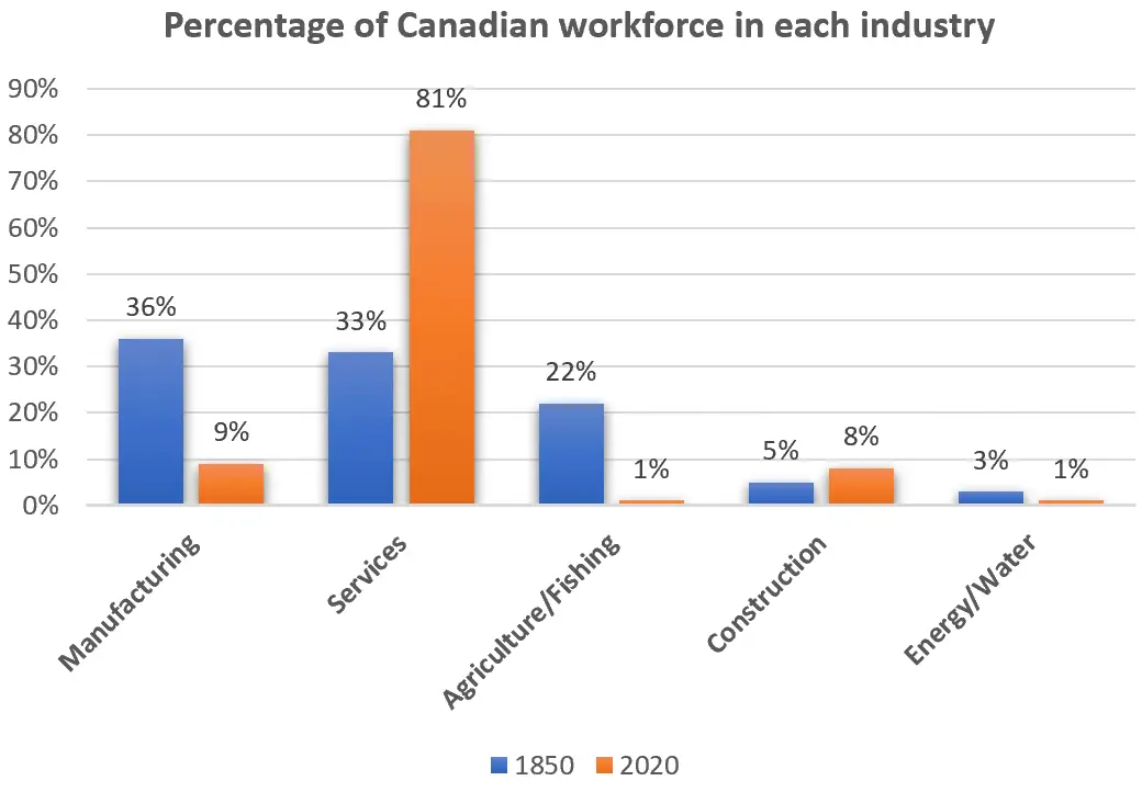
The bar chart shows the percentages of the Canadian workforce in five major industries in 1850 and 2020.
Summarise the information by selecting and reporting the main features, and make comparisons where relevant.
Write at least 150 words.

Sample Answer
The bar charts divide the Canadian workforce into five categories based on the industry they worked in between 1850 and 2020.
The overall trend in the data shows a steep rise in the proportion of employees engaged in the service industry, coupled with a decline in manufacturing. The most salient feature is that in 2020 81% of the workforce was involved in providing services, which contrasts sharply with the figure of 33% in 1850. In contrast, we observe a considerable drop in the manufacturing industry from over a third in the mid-nineteenth century to just 9% by the early twenty-first century.
Furthermore, the 170-year period saw a marked fall in the agriculture and fishing sectors, leaving food production with a tiny 1% of Canadian workers. Similarly, workers in energy and water companies decreased by two-thirds. On the other hand, the construction industry experienced significant growth from 5% to 8% over the period.
In general, the job profile of the Canadian workforce changed radically between 1850 and 2020, with the increases coming in the construction and service industry but all other areas seeing a decline.
