You should spend about 20 minutes on this task.
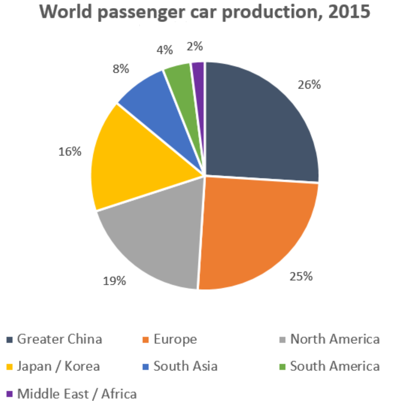
The graph shows data on the manufacture of passenger cars in 2015. Summarise the information by selecting and reporting the main features, and make comparisons where relevant.
Write at least 150 words.

Sample Answer
The pie chart gives the percentage of passenger cars manufactured by different regions of the world. For the purposes of this data set, the world is divided into seven regions.
What stands out is that the regions of Greater China and Europe lead the way in terms of the manufacture of passenger cars, with 26% and 25% respectively. By contrast, very few cars are produced in the Middle East and Africa: just 2% originate from that area.
Turning next to the Americas, a sharp contrast can be seen between the Northern and Southern parts of the continent. Whereas North America can boast 19% of the world’s passenger car production, South America manufactures just 4% of this type of vehicle.
Finally, moving on to Japan and Korea, despite the fact that they are just two countries rather than a whole region, they account for a sizeable proportion of the total, at 16%.
(151 words)
