You should spend about 20 minutes on this task.
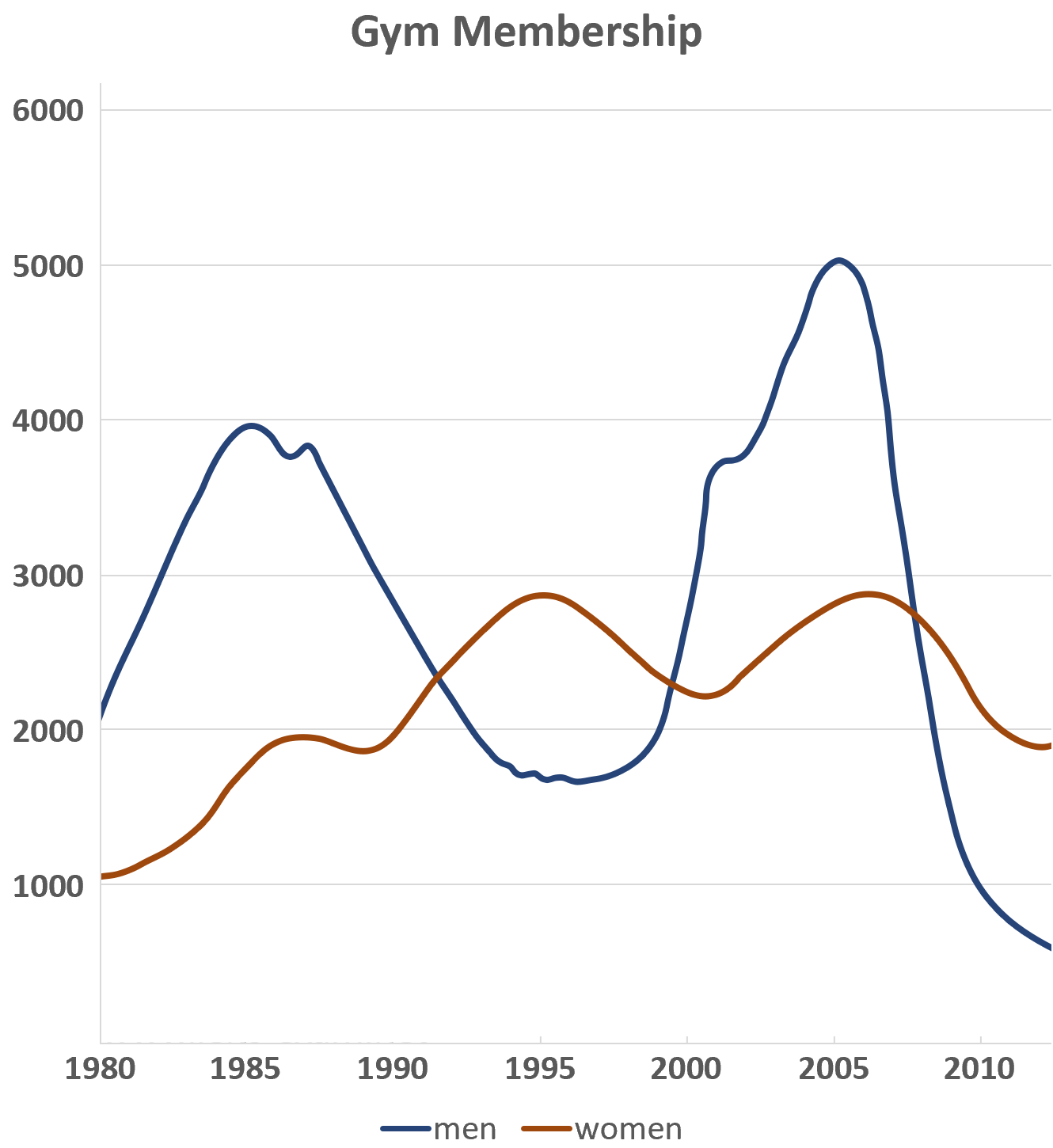
The graph gives information about male and female gym membership between 1980 and 2010. Summarise the information by selecting and reporting the main features, and make comparisons where relevant.
Write at least 150 words.

Sample Answer
The line graph shows male and female gym membership over thirty years. The vertical axis represents the number of members in units of 1,000. The horizontal axis represents the period from 1980 to 2010.
Overall, the graph indicates that there were more significant fluctuations in gym membership among men than among women. The number of male members started the period at just over two thousand and reached highs of four thousand in 1985 and five thousand around 2005. The lowest rates were between 1993 and 1997 and more recently in 2010 when the rate dipped as low as one thousand.
Female gym membership began lower at one thousand, doubled by 1984, and then fluctuated between two and three thousand for the remainder of the period. When male rates were at their lowest, female rates were higher. This was particularly true between 1993 and 1997 when over three thousand women held gym memberships.
In brief, there were marked differences in male and female gym membership rates in the period covered.
