You should spend about 20 minutes on this task.
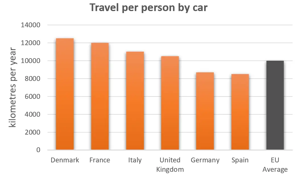
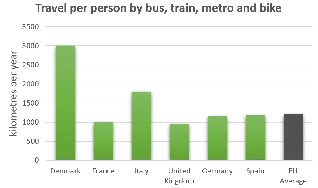
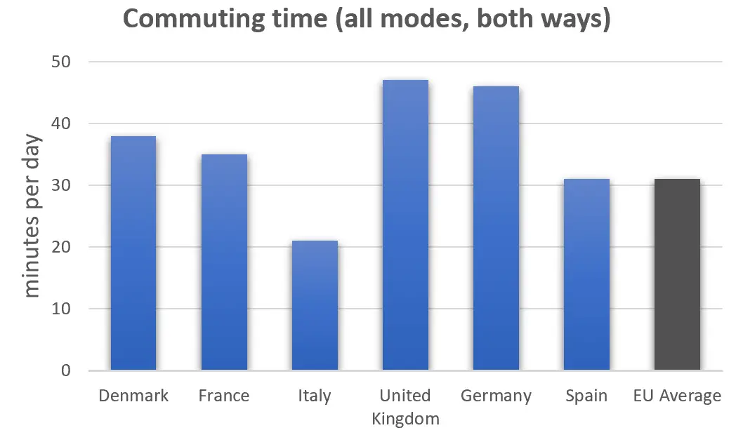
The bar charts below give information on road transport in a number of European countries. Summarise the information by selecting and reporting the main features, and make comparisons where relevant.
Write at least 150 words.


Sample Answer
The bar charts give information about methods of travel and commuting times for six European countries, as well as the average figure for the European Union. From the information, we can see that car use is highest in Denmark at about 12,500 kilometres per person a year, and lowest in Spain and Germany.
Perhaps surprisingly, the Danish also make far greater use of alternative transport than people in other countries, travelling over 3,000 kilometres a year by bus, tram, metro or bike, which is more than double the EU average. By comparison, the British and French travel less than a third of that distance by public transport.
When it comes to commuting times, British drivers spend about 47 minutes each day travelling to work, which is more than any other country. In Denmark and Italy, on the other hand, where many more people use public transport, commuting times are significantly lower.
(151 words)
