You should spend about 20 minutes on this task.
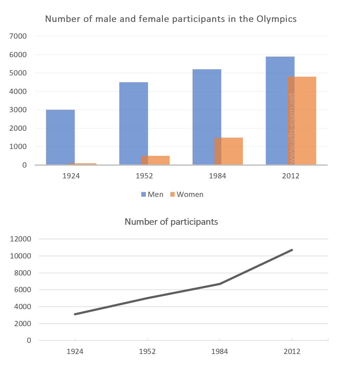
The chart and graph below give information about participants who have entered the Olympics since it began. Summarise the information by selecting and reporting the main features, and make comparisons where relevant.
Write at least 150 words.

Sample Answer
The two charts give information about the gender and number of athletes who have entered the Games since they started. The bar chart illustrates the number of men and women entering the Games, whereas the line graph shows the number of participants.
It is evident from the bar chart that, until 2012, there were always significantly more men entering the Games than women. In 1924 and 1952, there were hardly any women entering the Games, yet in 1952 there were over 4,000 male participants. In 2012, however, the number of female athletes rose significantly to nearly 5,000, only approximately 1,000 lower than male participants.
The line graph shows a similar trend, with the number of participants increasing throughout the century. The most significant increase occurred between 1984 and 2012, when the number of athletes rose from just over 6,000 to over 10,000 in 2012.
To summarise therefore, since 1924 the number of athletes entering the Olympic Games, has increased dramatically. This is particularly the case for women, who are now represented in nearly the same numbers as male participants.
(179 words)
