You should spend about 20 minutes on this task.
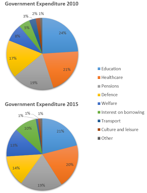
The charts below show local government expenditure in 2010 and 2015. Summarise the information by selecting and reporting the main features, and make comparisons where relevant.
Write at least 150 words.

Sample Answer
The charts show the percentage breakdown of government spending across nine categories in 2010 and 2015. Over the five years, there were significant changes in expenditure.
In both years, the four largest areas of government expenditure were: education, healthcare, pensions, and defense, with education taking the largest share (24% in 2010 and 21% in 2015). The minor areas of expenditure were transport, culture and leisure, and “other.” Interest in borrowing and spending on welfare lay in between.
Interestingly, between 2010 and 2015, spending on all four of the most significant areas had dropped, except pensions, which remained the same at 19%. Spending on transport, culture, and leisure also fell significantly, with the transport budget declining by two-thirds. On the other hand, spending on welfare and interest on government borrowing rose markedly, doubling over the five years to 10%.
Overall, the charts indicate that the government has had to cut expenditures in most areas to fund the cost of borrowing and welfare.
