You should spend about 20 minutes on this task.
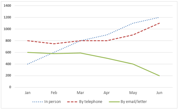
The graph below shows the number of enquiries to tourist information office made by telephone, letter/email, and in person from January 2001 to June 2001. Summarize the information by selecting and reporting the main features, and make comparisons where relevant.
You should write at least 150 words.
Number of enquiries to tourist Information office

Sample Answer 1
The line graph outlines the number of queries a tourist information centre received during the first half of 2001 via phone calls and letter/electronic mail as well as by people in person. Generally speaking, people started making more personal enquiries after March 2001 while email and letter queries dropped.
As the graph suggests, the tourist information office received around 1800 enquiries from people in January 2001, of which the maximum came through phones. Against 800 phone queries at that time, they got 600 emails and letters and 400 in-person visits from people regarding information. The number of emails or postal queries dropped over the period, and in June, the office received only 200 such queries, one-third of starting of the year.
Interestingly, more people visited the office to log their questions, reaching 1200 in the middle of the year. Though telephone enquiries were predominant at the beginning of the year, they remained constant between January and April. Afterwards, the number of telephone enquiries increased and reached about 1100 in June 2001, slightly lower than the number of enquiries made in person. The total number of such proof made by people to this tourist office increased to nearly 2500, almost 500 more enquiries than in January.
Sample Answer 2
The given line graph illustrates how many enquiries were received by The Tourist Information Office in one city over 6 months in 2011, according to three different manners.
In general, the number of enquiries received by letter or email experienced a slight decrease, while a substantial rise in enquiries was recorded on the site and via telephone.
As presented in the chart, starting at just over 400 units in January, the number of off-site enquiries witnessed a significant increase to 1900 units in Jun. Despite a higher starting point, with 900 enquiries which doubled the number of enquiries received in person, the volume of telephone ones had undertaken the offline cases, with only 1600 enquiries in June.
In contrast, In January, the figure for enquiries by letter or email stood at nearly 800, and then a marginal drop of 200 units was observed in the next six months.
Sample Answer 3
The line chart illustrates the number of inquiries sent to the Tourist Information Office in a particular city through three means of communication between January and June of 2011.
Visitors to the city made more inquiries in person and via telephone, while letters or emails became a less common choice. Also, the number of enquiries in person experienced the most dramatic change among the given methods.
In the first month of 2011, the Tourist Information Office received 900 enquires by telephone, while just under 800 were sent by letter or email. Not many tourists chose to ask for information in person, with just above 400 queries. Over the next three months, the telephone remained the most popular method with 1000 enquires. Meanwhile, the number of enquiries made in person grew considerably to 800 emails, surpassing the figure for email and postal enquires.
From March to June, the office received significantly more enquires in person. Just after four months, the number of enquires by this way soared by more than 1,000 to peak at 1,900 in June. The period also recorded a significant rise to 1,600 in the figure for the telephone. By contrast, fewer people sent emails or letters to make enquires, and the number ended at the lowest point of only under 400.
