You should spend about 20 minutes on this task.
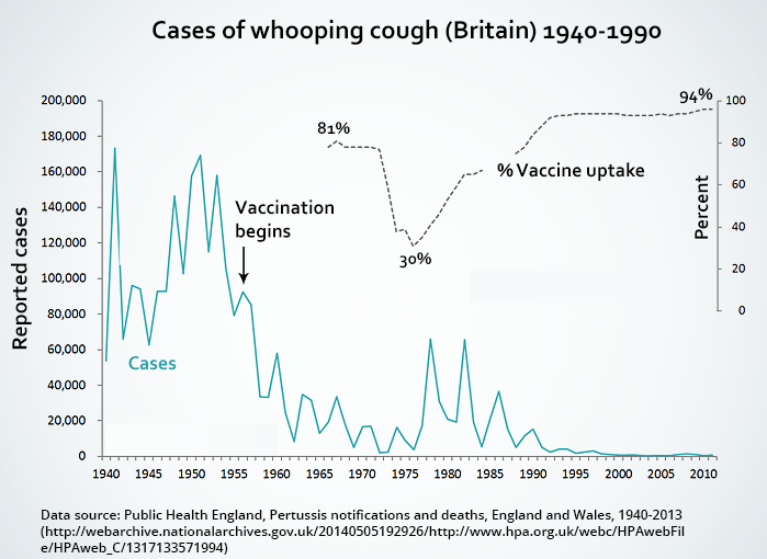
The graph shows the impact of vaccinations on the incidence of whooping cough, a childhood illness, between 1940 and 1990 in Britain. Summarise the information by selecting and reporting the main features, and make comparisons where relevant.
Write at least 150 words.

Sample Answer
The graph shows the changing number of cases of whooping cough in Britain from 1940 to 1990, and how the introduction and use of a vaccine for the disease affected the pattern. Apparently, there was a direct link between the administration of the vaccine and the number of cases of whooping cough among children during this period in history.
Overall, the number of cases fell from a high of 170,000 to almost zero. However, there were significant fluctuations in the trend. For example, just after 1940, there was a surge in the number of cases from 50,000 to approximately 170,000. Although the figure fell back in the next few years, it peaked again in the early 1950s and fluctuated considerably until the introduction of a vaccination in the late 1950s.
Following this, the number of cases dropped sharply to well below 20,000 in the mid-1970s, until a sudden fall in vaccinations, from 81 percent to 30 percent, resulted in a parallel rise in the incidence of the illness. Figures then went up again to 60,000 around 1980, but gradually fell back to their earlier level as vaccinations were resumed. By 1990, 94 percent of children were being vaccinated against whooping cough, and there were few, if any, cases.
(208 words)
