You should spend about 20 minutes on this task.
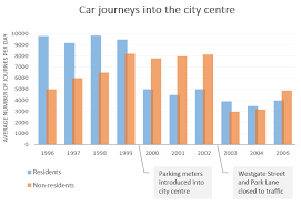
The bar chart gives information about the number of car journeys into the city centre made by residents and non-residents. Summarise the information by selecting and reporting the main features, and make comparisons where relevant.
Write at least 150 words.

Sample Answer
The graph shows the number of car journeys into the city centre made by residents and non-residents over a ten year period. In 1996 an average of just under 10,000 journeys per day were being made by residents, while approximately half that number were made by non-residents. Over the subsequent three years, resident journeys remained reasonably stable, while non-resident journeys increased each year, exceeding 8,000 per day in 1999.
In early 2000, parking meters were introduced into the city centre, and this had the effect of virtually halving resident traffic, although non-resident traffic decreased only slightly. By the end of 2002, the number of resident journeys had not altered significantly, but non-resident journeys had risen to their 1999 level. At this point, Westgate Street and Park Lane were pedestrianised. This resulted in a dramatic decline in non-resident traffic, and a slight decrease in resident traffic. From this point onward, resident traffic remained more or less at the same level, while non-resident traffic resumed its upward trend, reaching nearly 5,000 journeys per day in 2005.
(174 words)
