You should spend about 20 minutes on this task.
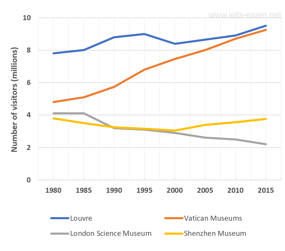
The graph shows the number of visitors to four international museums between 1980 and 2015. Summarise the information by selecting and reporting the main features, and make comparisons where relevant.
Write at least 150 words.

Sample Answer
The line graph shows how many people visited four museums in different countries in the world between 1980 and 2015.
All in all, the Louvre Museum was the most popular, with between approximately 8 and 9 million visitors each year. The least popular were the Shenzhen and the London Science Museum, with no more than 4 million visitors each year.
The number of visitors to the London Science Museum decreased slowly from just over 4 million in 1980 to around 2 million in 2015. By contrast, the visitors to the Vatican Museum increased from just under 5 million in 1980 to around 9 million in 2015.
In addition, the number of visitors to the Shenzhen Museum stayed about the same over the thirty-five-year period. They fell from just under 4 million in 1980 to just over 3 million in 2000 and then rose to just under 4 million again in 2015.
(151 words)
