You should spend about 20 minutes on this task.
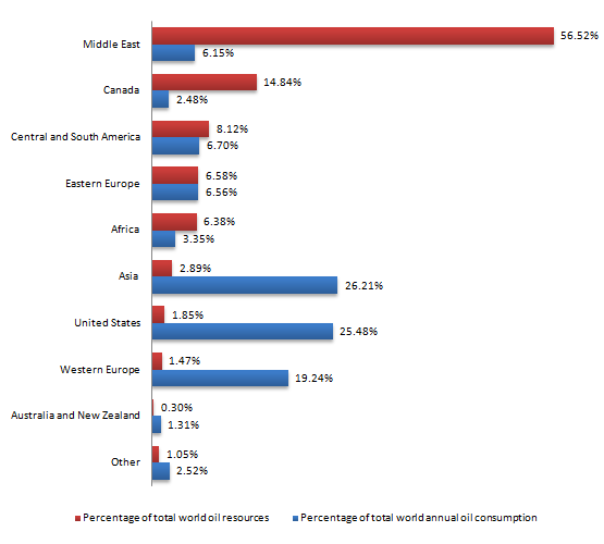
The chart below shows the proportions of the world’s oil resources held in different areas, together with the proportions consumed annually in the same areas. Summarise the information by selecting and reporting the main features, and make comparisons where relevant.
Write at least 150 words.

Sample answer
The charts shows the oil resources held, together with the proportions consumed within the same area each year, in different areas of the world.
It is obvious that the region holding the most oil resources is the Middle East, with 56.52%, over a half of total world oil resources while in the United States and Asia, the level of oil consumed each year is for more away from the oil resources they hold. The percentage of total world oil consumption of United States and Asia are 25.48% and 26.21% respectively. They are the highest oil consumption region in the world.
Another place that is worth mentioned will be the Western Europe. With about twenty percent of total world oil consumption, the Western Europe merely holds less than 1.5% of the oil resources in the World.
Regions that are not mentioned above have the close percentage between oil holding and consuming whereas Canada has the highest level of oil holding than consuming, the respective figures are 14.84% and 2.48%.
Overall, the charts suggest that Middle East is the only majority at oil resources held, while Asia, United States and western have the highest level at oil resources imported.
(197 words)
