You should spend about 20 minutes on this task.
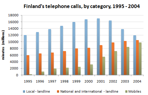
The chart below shows the total number of minutes (in millions) of telephone calls in Finland, divided into three categories, from 1995 – 2004. Summarise the information by selecting and reporting the main features, and make comparisons where relevant.
Write at least 150 words.

Sample answer
The chart shows the time spent by Finland’s residents on different types of telephone calls between 1995 and 2004.
Local landline calls were the highest throughout the period, rising from 12000 million minutes in 1995 to just under 17000 million in 2000. After peaking at 17000 million the following year, these calls had fallen back to the 1995 figure by 2004.
National and international landline calls grew steadily from 6000 million to 10500 million at the end of the period in question, though the growth slowed over the last two years.
There was a dramatic increase in mobile calls from 250 to 9800 million minutes. This rise was particularly noticeable between 2000 and 2004, during which time the use of mobile phones tripled.
To sum up, although local landline calls were still the most popular in 2004, the gap between the three categories had narrowed considerately over the second half of the period in question.
(155 words)
