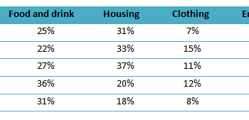
The proportion of monthly household income in five European countries
You should spend about 20 minutes on this task. The table illustrates the proportion of monthly household income spend on food and drink, housing, clothing...
You should spend about 20 minutes on this task. The table illustrates the proportion of monthly household income spend on food and drink, housing, clothing...
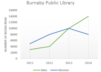
» You should spend about 20 minutes on this task. The graph below shows the number of books read by men and women at Burnaby Public...
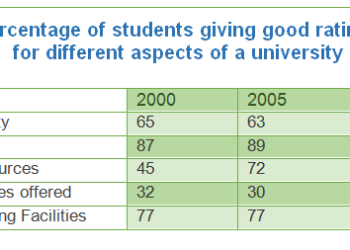
You should spend about 20 minutes on this task. The table below shows the results of surveys in 2000, 2005 and 2010 about one university....
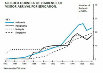
» You should spend about 20 minutes on this task. The graph below shows four countries of residence of overseas students in Australia....
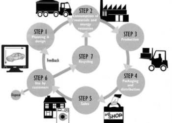
» You should spend about 20 minutes on this task. The diagram below shows the environmental issues raised by a product over its...
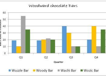
» You should spend about 20 minutes on this task. The graph below shows the quarterly sales figures of Woodward chocolate bars for...
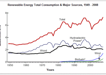
» You should spend about 20 minutes on this task. The diagram shows the consumption of renewable energy in the USA from 1949-2008....
» You should spend about 20 minutes on this task. The following chart illustrates the results of a British survey taken in 2005...
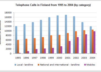
» You should spend about 20 minutes on this task. The chart below shows the total number of minutes (in millions) of telephone...
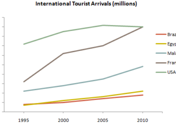
» You should spend about 20 minutes on this task. The graph below gives information about international tourist arrivals in five countries. Summarise...
9IELTS is dedicated to providing free materials and resources for IELTS conquerors. Stay constantly updated with a wide range of ultimate tips, strategies, and practice tests to crack the high-stakes IELTS exam!