Changes in three areas of crime in New Port city
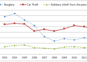
» You should spend about 20 minutes on this task. The chart below shows the changes that took place in three different areas of crime in...
» You should spend about 20 minutes on this task. The chart below shows the changes that took place in three different areas of crime in...
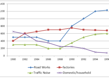
» You should spend about 20 minutes on this task. The graph below shows the number of complaints made about noise to Environmental Health authorities in...
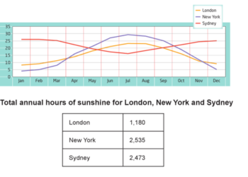
» You should spend about 20 minutes on this task. The graph and table below show the average monthly temperatures and the average number of hours...
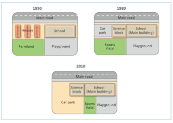
» You should spend about 20 minutes on this task. The diagram shows the changes that have taken place at West Park Secondary School since its...
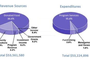
You should spend about 20 minutes on this task. The pie chart shows the amount of money that a children's charity located in the USA...
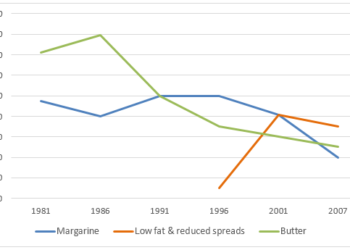
» You should spend about 20 minutes on this task. The line graph below shows changes in the amount and type of fast food consumed by...
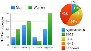
» You should spend about 20 minutes on this task. The bar chart below shows the numbers of men and women attending various evening courses at...
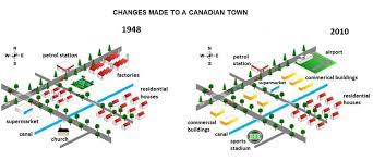
» You should spend about 20 minutes on this task. The map below shows the changes in an American town between 1948 and 2010. Summarise the...
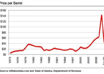
» You should spend about 20 minutes on this task. The line graph shows the historical oil prices per barrel from 1973 to January 2009. Summarise...
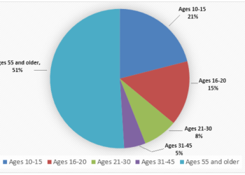
» You should spend about 20 minutes on this task. The chart shows the number of visitors to a local cinema according to age in 2000....
9IELTS is dedicated to providing free materials and resources for IELTS conquerors. Stay constantly updated with a wide range of ultimate tips, strategies, and practice tests to crack the high-stakes IELTS exam!