You should spend about 20 minutes on this task.
The first graph gives the number of passengers travelling by train in Sydney. The second graph provides information on the percentage of trains running on time. Summarise the information by selecting and reporting the main features, and make comparisons where relevant.
You should write at least 150 words.


Sample Answer
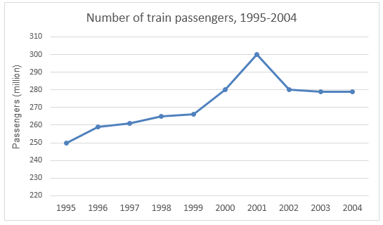
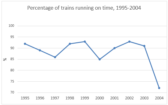
The line graphs give data on the number of train commuters in Sydney from 1995 to 2004 and outline the ratio of trains that ran on time during the same period. As an overall trend, the number of rail passengers in Sydney gradually increased between 1995 to 2002 and in 2004 a higher percentage of locomotives failed to run on time.
As the data suggests, 250 million passengers used the train transportations in 1995 in Sydney and this number slowly increased in the next 4 years. In 1999, train commuters’ number in Sydney was around 265 million and it abruptly hiked in the next two years before dropping again in 2002. In 2000, 280 million passengers used locomotives and this number further increased and reached to the highest, 300 million, in 2001. From 2002 to 2004 the train commuters’ number remained constant at 280 million.
Besides, more than 92% trains in 1995 arrived and reached their destination on time but this record deteriorated and dropped to just over 85% in 1997. In 2000, almost 15% rails failed to maintain the schedule and this scenario was worst in 2004 when more than 25% trains in Sydney could not run on time.
