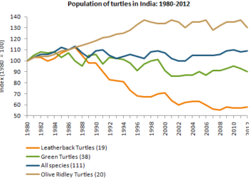
The population figures of different types of turtles in India between 1980 and 2012
You should spend about 20 minutes on this task. The graph below shows the population figures of different types of turtles in India...
You should spend about 20 minutes on this task. The graph below shows the population figures of different types of turtles in India...
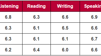
You should spend about 20 minutes on this task. The table below shows the average band scores for students from different language groups...
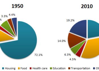
You should spend about 20 minutes on this task. The pie charts below show the average household expenditures in a country in 1950...
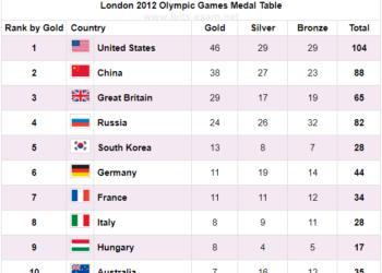
You should spend about 20 minutes on this task. The table below shows the number of medals won by the top ten countries...

Complete the description of the table using an appropriate word, words or number. reasons for shopping at ASDA supermarketno. of menno. of womenclose...
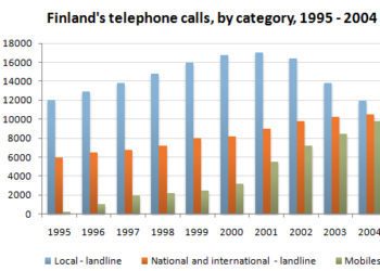
You should spend about 20 minutes on this task. The chart below shows the total number of minutes (in millions) of telephone calls...
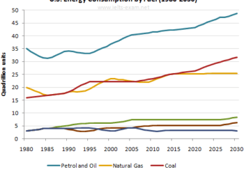
You should spend about 20 minutes on this task. The graph below gives information from Annual Energy Outlook 2008 about consumption of energy...

You should spend about 20 minutes on this task. The bar chart below gives information about the number of students studying Computer Science...
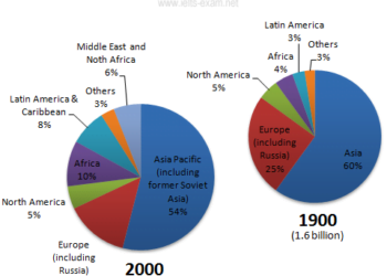
You should spend about 20 minutes on this task. The pie charts below give information about world population in 1900 and 2000. Summarise...

You should spend about 20 minutes on this task. The diagram below shows the production of steam using a gas cooled nuclear reactor....
9IELTS is dedicated to providing free materials and resources for IELTS conquerors. Stay constantly updated with a wide range of ultimate tips, strategies, and practice tests to crack the high-stakes IELTS exam!