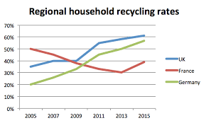
Household recycling rates in three different countries
» You should spend about 20 minutes on this task. The line graph below shows the household recycling rates in three different countries between 2005 and...
» You should spend about 20 minutes on this task. The line graph below shows the household recycling rates in three different countries between 2005 and...
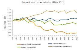
» You should spend about 20 minutes on this task. The graph below gives information on the population of turtles in India from 1980 to 2012....
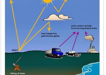
» You should spend about 20 minutes on this task. The following diagram shows how greenhouse gases trap energy from the Sun. Write a report for...
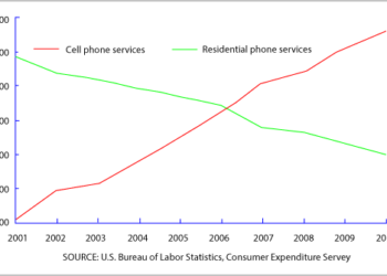
» You should spend about 20 minutes on this task. The graph below shows US consumers' average annual expenditures on the cell phone and residential phone...
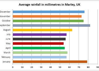
You should spend about 20 minutes on this task. The chart shows average levels of rainfall in Marley in the UK. Summarise the information by...
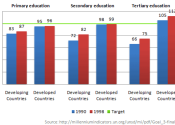
» You should spend about 20 minutes on this task. The chart below shows the number of girls per 100 boys enrolled in different levels of...
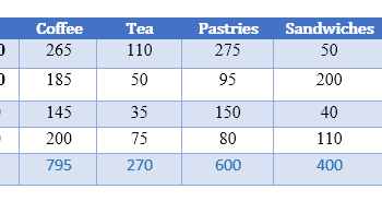
» You should spend about 20 minutes on this task. The table below shows sales made by a coffee shop in an office building on a...
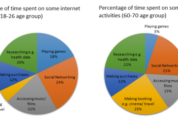
» You should spend about 20 minutes on this task. The charts below show the percentage of time younger and older people spend on various Internet...
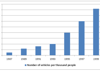
» You should spend about 20 minutes on this task. The graph below shows the number of vehicles owned by per thousand people in China from...
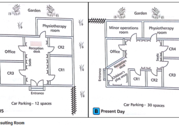
» You should spend about 20 minutes on this task. Plan A below shows a health centre in 2005. Plan B shows the same place in...
9IELTS is dedicated to providing free materials and resources for IELTS conquerors. Stay constantly updated with a wide range of ultimate tips, strategies, and practice tests to crack the high-stakes IELTS exam!